


For personal, non-commercial projects only (portfolios, personal blogs, hobby projects).
About
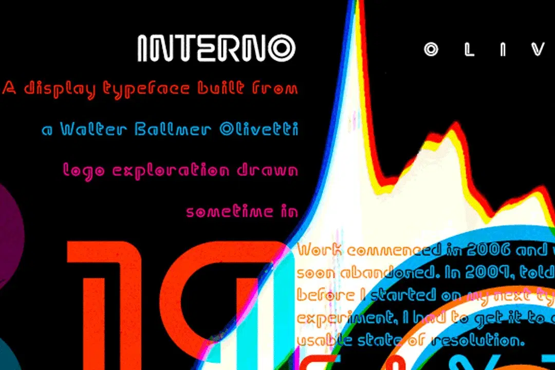
Interno is a headline typeface duo built from a Walter Ballmer Olivetti logo exploration drawn sometime in 1960.
Work on Interno commenced in 2006, but was soon abandoned. In 2009, Eli Carrico picked it up and ran with it, completing Interno 1. Ian Lynam picked through Eli’s development stages of the typeface and edited together an alternate version, Interno 2, utilizing a mix of development characters and original characters.
Interno is Italian for “internal” (or at least that is what the translation widget told us). A great deal of the classic Olivetti design was done in-house (i.e. internal). Also, the typefaces have internal switchbacks reminiscent of a paperclip. Interno sounds a bit like “turning inside” phonetically (In-Turn-O). Additionally, Interno takes the first letter and last letter of Olivetti and flips it.
Interno is a highly contemporary display font that bends in on itself, evoking classic Italian modern graphic design.
Shop confidently with Shuppi
If your download isn’t what was promised, we’ll make it right. Eligible purchases can be refunded within fourteen calendar days when listings mislead, files fail, or duplicate checkouts happen.
- Listings must match what you receive—no surprises.
- Corrupted files or technical issues? Request a quick fix or refund.
- Duplicate purchases are covered without the hassle.